Dojo / Brand & integration guide
A place to practice.
A system with purpose.
Open Gate is the entry to the practice room. Washi gives reading room to breathe; Sumi keeps long sessions quiet. This guide explains the assets, their roles and how to carry the identity into the product.
01 / Logo
Open Gate.
An open threshold, drawn with four restrained strokes. It evolves Dojo’s torii mark and
pairs with the familiar dojo_ wordmark. The underline suggests work still
in progress.

Washi / reading and public pages

Sumi / dark surfaces and session contexts
 Icon
Icon Icon
Icon
Use the full lockup when the product name matters. Use the mark alone for favicons, compact navigation and app icons. Leave at least one stroke-width of clear space around the artwork. Do not stretch it, add shadows, turn it into a verdict badge, or animate it repeatedly. The exported wordmark is outlined and works without installed fonts.

02 / Product system
The vocabulary does work.
Explain the plain meaning on first contact. The Japanese names identify different activities; they should help people navigate, not make them decode the interface.
| Term | Purpose | How to present it |
|---|---|---|
| Kata | A focused practice unit with a time limit and an evaluation. | Show the title, type, challenge and time. Keep the primary action clear. |
| Scroll | An external learning app embedded in Dojo. | Lead with what it teaches. Published content and access depend on the operator’s catalogue. |
| Skill level | Junior, mid or senior preference used in kata selection. | A challenge preference. Never label it as a verified qualification. |
| Belt | A rank computed from sustained and varied practice. | White → yellow → green → brown → black. Always pair rank color with its name. |
| Verdict | The sensei’s assessment of one attempt. | Passed, Passed with notes or Needs work. No numeric score; no implication of belt promotion. |
| Milestone | A one-time recognition of a particular moment. | Name the event. It is separate from rank and from challenge difficulty. |
| Engawa | The anonymous code playground. | Explain it as “a place to try a snippet” before asking someone to learn the name. |
Kumite remains planned. It does not belong in a shipped-feature list. Scroll infrastructure and the available learning catalogue are different claims; say which one you mean. See these terms in the product presentation.
03 / Color & tokens
Paper. Ink.
One deliberate accent.
Colors are roles. Change the theme to inspect their values; this page reads the generated palette derived from the app’s canonical CSS.
Washi: warm reading surface / Sumi: quiet dark surface
Page
--color-pageThe canvas behind the content.
Surface
--color-surfaceA bounded editor, panel or example.
Primary text
--color-primaryBody copy, headings and essential values.
Secondary text
--color-secondaryDescriptions and readable metadata.
Hanko vermillion
--color-accentPrimary actions, links, focus and the mark.
Border
--color-borderQuiet boundaries, never a substitute for hierarchy.
Success
--color-successPositive state markers paired with text.
Warning
--color-warningCaution and “Passed with notes” markers.
Use --color-on-accent on filled accent buttons. The brand accent is not a universal text color: keep small labels neutral on dark surfaces, and use red for the logo, focus indicators and filled actions. Use secondary, rather than
muted, for text people must read. Status colors and belt colors do different jobs; do not
substitute one for another. Use a label beside every status color, and measure contrast on
the actual foreground/background pair.
04 / Typography
Readable first.
Technical where it matters.
Two existing families, each with a job. Fonts are served locally, with system fallbacks. Avoid a third display font that makes the guide look detached from the app.
Inter / content and interface
Think through
the trade-off.
Use regular weight for body copy, medium for controls and semibold for headings. Give long explanations comfortable line height and a restrained line length.
Body: 15 px / 24 px · UI: 13 px / 20 px
Guide headings scale with the viewport.
JetBrains Mono / code and identity
dojo_
return practice;
Use it for the wordmark, code, timers and compact technical labels. Use tabular figures for changing or aligned numbers; keep paragraphs in Inter.
Code and labels: 11–13 px
No blinking cursor on static marketing assets.
05 / UI & usability
Keep the work
in the foreground.
The interface should distinguish learning, practice and progress without adding a layer of spectacle. These examples show the brand treatment; they are not live kata controls.
Illustrative kata card
Find the race condition.
Identify the assumption that fails when two requests reach the same resource together.
CODE · MID · TIMED PRACTICE
- One clear next action. Lead with the work the person came to do. Leave navigation and secondary actions quiet.
- Separate intent from rank. Level helps select a challenge. Belt reflects practice. Verdict describes one attempt.
- Use space before boxes. Small 4–6 px corners and surface stacking. No glow, celebratory gradients or ornamental dashboards.
- Keep states explicit. Empty catalogues, unavailable scrolls and failed execution need plain descriptions and a recovery action.
- Protect readability. Visible keyboard focus, generous touch targets, labels with color, no horizontal page overflow at 320 px.
- Reserve motion for a job. A short functional transition is enough. Honor reduced motion; keep frequent practice surfaces quiet.
06 / Voice
Direct about the work.
Respectful of the person.
Dojo is candid, technical and comfortable with imperfection. Humor may lighten the delivery, but it must not replace a precise observation or soften an evaluation.
“The query works. It scans the whole table. Explain the index you would add.”
“Amazing work! You’re becoming a coding master.”
The examples above are authored voice specimens. Product copy should name the problem, the outcome and the next step. Public marketing explains katas and scrolls before relying on their names. Never invent testimonials, user counts, guaranteed skill improvement or a learning catalogue.
07 / Share & marketing assets
A clear preview
before the click.
Use this project card for links to Dojo, repository presentation and announcements. It describes the product; it contains no personal verdict, invented usage metric or testimonial.
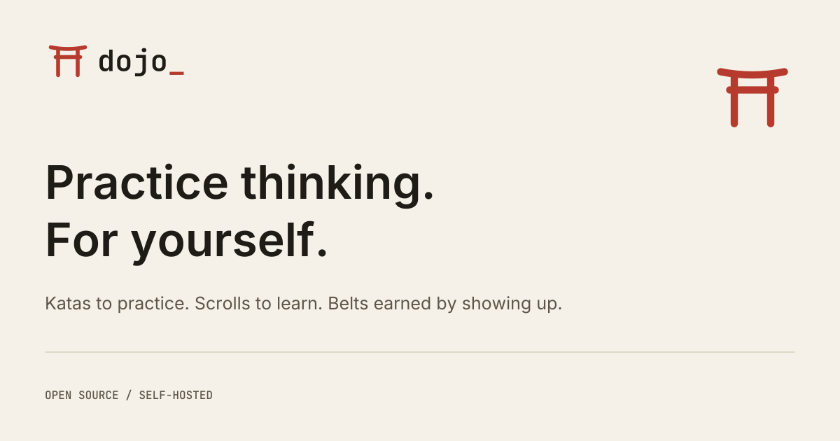
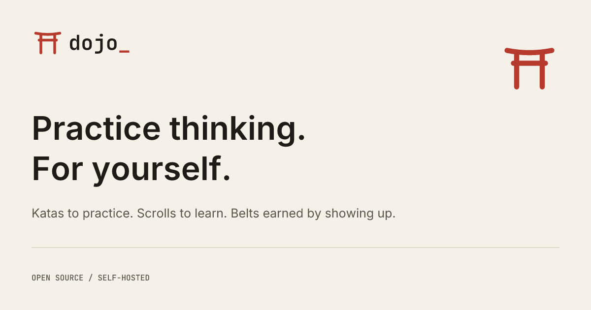


The PNG cards are 1200 × 630. Use the PNG in Open Graph and Twitter metadata; keep the SVG
as the editable source/export. For the repository’s social preview upload
brand/social-sumi.png: GitHub shows it on a dark or light page alike, and the Sumi card keeps its contrast on both. Check the crop in GitHub. A session share card is a different resource: retain
its real verdict, kata and quote when applying the visual system.
<meta property="og:image"
      content="https://YOUR-HOST/brand/social-washi.png">
<meta name="twitter:card" content="summary_large_image">
08 / Integration
Use the source.
Regenerate the exports.
The public site and brand guide are ready for the existing GitHub Pages workflow. The application integration follows the same mark and semantic tokens, without moving domain logic.
| Resource | Canonical source | Used for |
|---|---|---|
| Mark geometry | apps/web/src/brand/logo.json |
The React mark and every exported SVG. |
| Outlined wordmark | design/brand/wordmark.svg |
Font-independent logo lockups. |
| Color roles | apps/web/src/styles/main.css |
App themes and generated site palette. |
| Social composition | design/brand/social-template.svg |
Editable project card; color and logo placeholders are filled during generation. |
| Marketing | site/index.html |
What Dojo does and how to start. |
| This guide | site/brand.html |
Asset purpose, downloads and integration. |
1. Generate and verify assets
Run from the repository root after changing canonical geometry, palette or the social composition. The generator uses the existing API SVG renderer; install workspace dependencies first. Outputs are checked in so GitHub Pages can serve the static directory.
pnpm install --frozen-lockfile
node scripts/brand-assets.mjs
node scripts/brand-assets.mjs --check
pnpm test:scripts
The check fails on stale exports, missing downloads, broken local anchors and root-relative URLs that would escape the project base path. It never treats a missing file as a clean result.
2. Integrate into the React application
The existing LogoMark reads canonical geometry, and
LogoWordmark keeps its component API. Reuse those components in headers,
navigation and login. Use semantic classes such as text-accent and
text-primary; keep long content in the sans family.
import { LogoWordmark } from './components/Logo'

<LogoWordmark markSize={24} />
<LogoWordmark showMark={false} />
Dojo already supports Washi and Sumi through data-theme and its theme
controls. This delivery does not switch every existing screen to a new default or alter
evaluation and progression. Check the affected screen in both themes before changing
token values.
3. Integrate session sharing
The dynamic renderer lives at
apps/api/src/infrastructure/http/routes/share.ts. It must keep the actual
kata, verdict, quote and visibility rules. The project PNG is for project marketing and
must not replace a personal session’s image. Applying the new visual treatment to that
renderer is a separate integration step.
4. Publish with GitHub Pages
The existing workflow uploads site/ when its files change on
master. No framework build or new hosting service is needed. Preview the
directory under a /dojo/ path before publishing; all local links and assets
remain relative.
python3 -m http.server 3118 --bind 127.0.0.1 --directory site
# Open http://127.0.0.1:3118/

# Intended project URLs after publication:
# https://rodacato.github.io/dojo/
# https://rodacato.github.io/dojo/brand.html
Update canonical URLs and absolute social-image URLs if the Pages host changes. Publishing requires the normal repository review and merge. A local preview is not proof of deployment.
5. Apply repository and app icons
The generated favicon (SVG and ICO) and the 180 × 180 apple-touch icon PNG are wired to the
project site and web app. The icon SVG exports are source material for an app
installation icon; they do not establish a PWA or promise
offline use. For GitHub, upload brand/social-sumi.png as the repository social preview and
inspect its crop. That repository setting is not changed by committing these files.
Keep the identity aligned as one change: update canonical files, regenerate exports, verify the site, then review the affected product surfaces. The guide demonstrates the system; it does not create a second component library.